User research summary
I conducted interviews with several individuals and created empathy maps in order to understand the users for which I’m designing the product for and also their needs. There were several types of individuals but a certain group stood out the most, and they were university students with part time jobs and working individuals who had busy schedules and therefore had trouble making their own food.
There were also several other areas in which they thought an app might help them and the others in ordering food. Some of the areas were: waiting in queues for order placement and pickup/ delivery, restaurant menu browsing and also payments.
User pain points
1
Time
Students and working individuals have a very tight schedule and therefore is unable to prepare their own meals.
2
Unavailability
The busy schedules makes individuals make late orders and therefore at times the meals they want are unavailable.
3
Accessibility
Due to certain language barriers and disabilities, users expect platforms with accessibility features.
4
IA
Clustered menus take a lot of time when ordering a certain food item and at times makes it unable to find the meals.
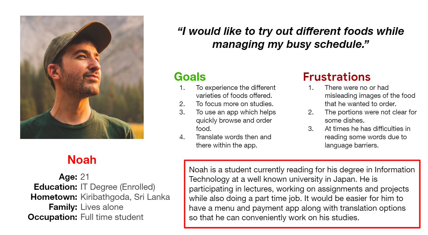
User persona: Noah
Problem Statement: Noah is a hard working busy student who needs an easy to use and navigate, menu and payment app for a restaurant because he has to manage his limited time and focus more on his studies and part time job.
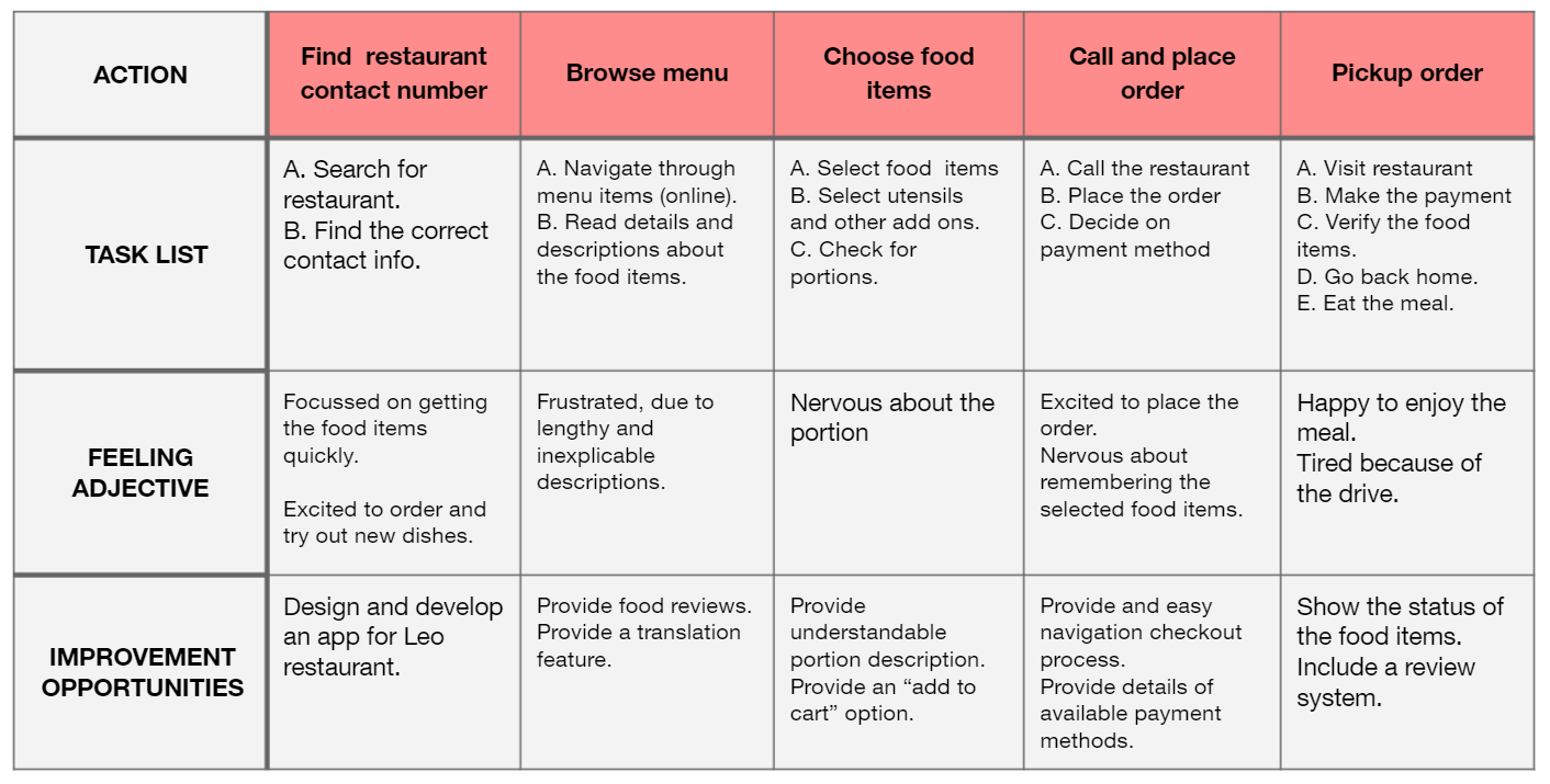
User Journey Map
Mapping Noah’s user journey showcased how helpful it would have been if there was a dedicated Dinemore Restaurant App to order and make payments.
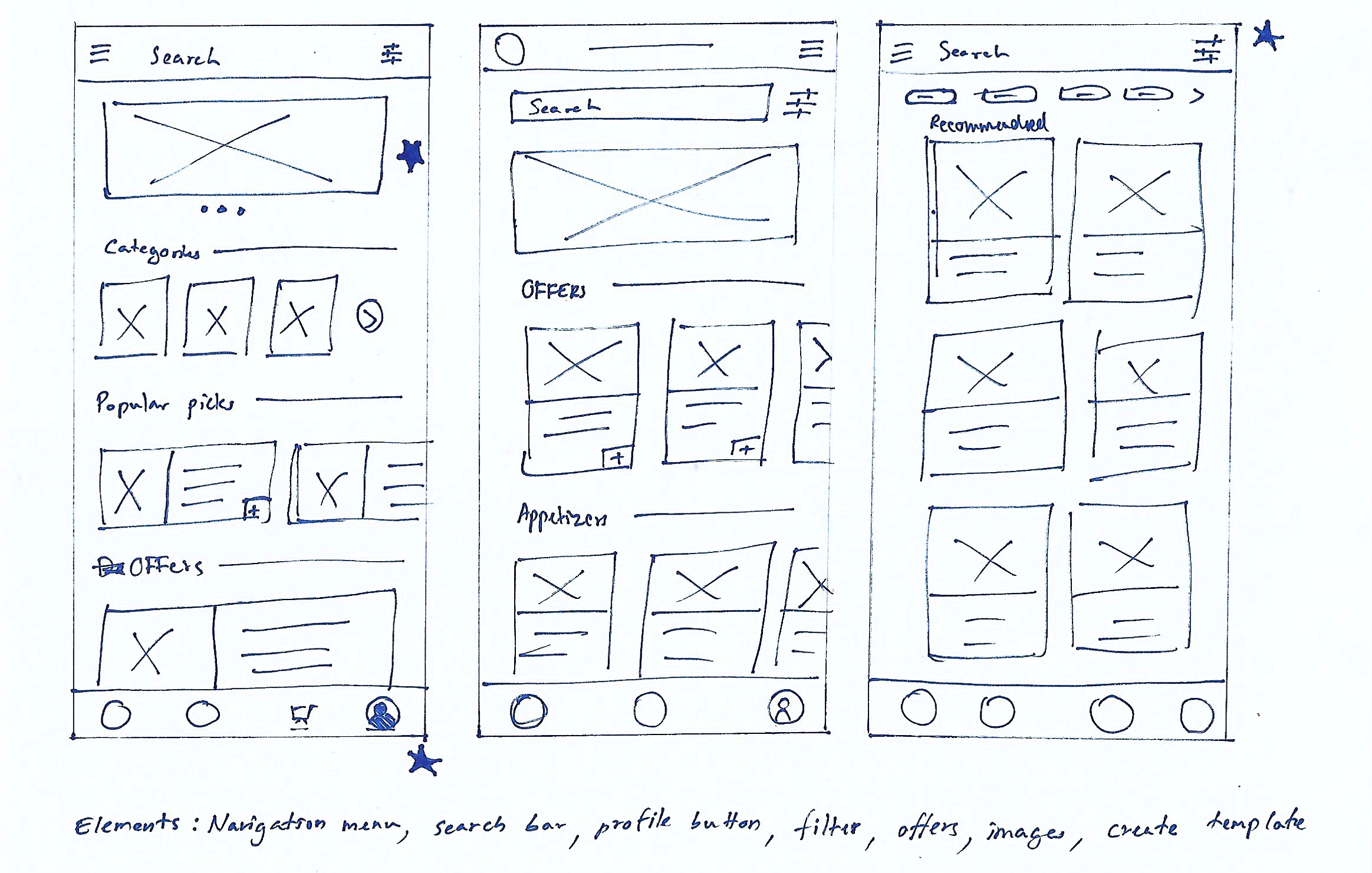
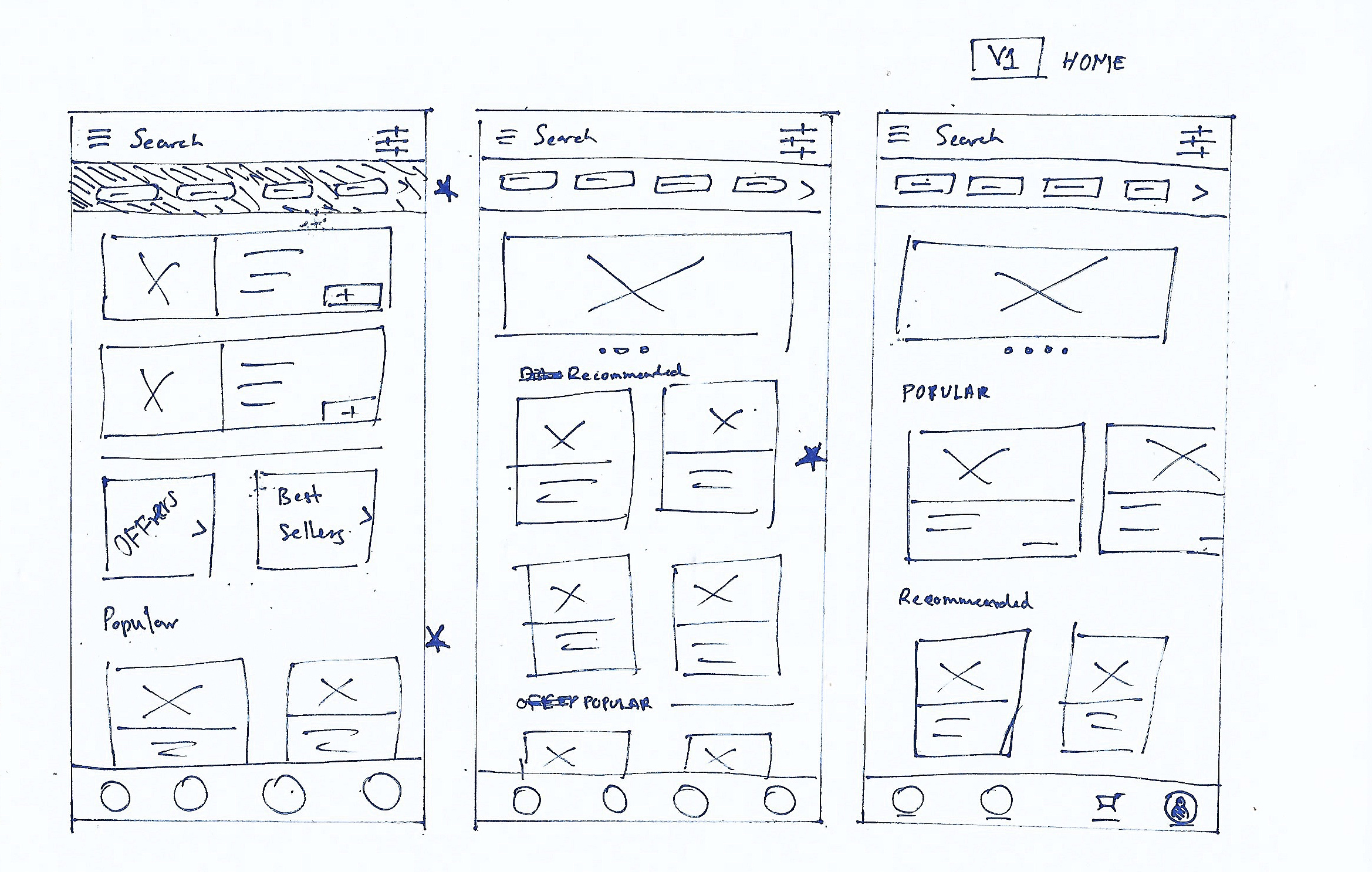
Paper Wireframes
Several iterations of drafts for each screen was done until the best fitting design solution was found so that it aligns with the project goals. The image on the right shows five iterations for the home screen and the one which was finalized. The stars indicates the chosen components in the wireframe which was included to the final version.
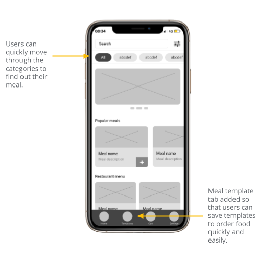
Digital Wireframes
In the initial design phase, I made sure to focus on the user research findings and feedback.
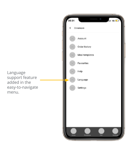
Easy navigation and addition of the feature of language change as part of the use of accessistive technologies.
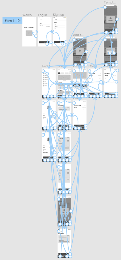
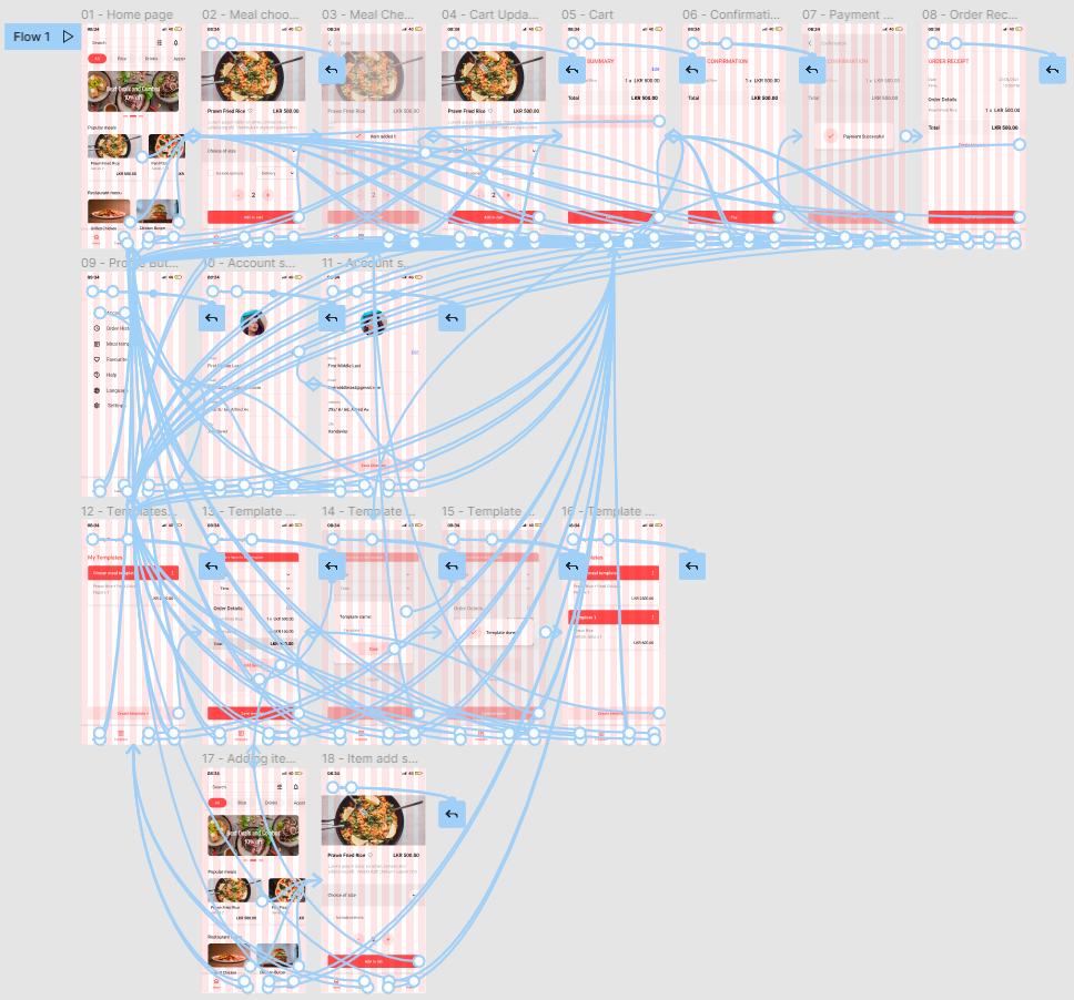
Low fidelity prototype
The wireframe screens connected with each other for the main and sub user flows so that the wireframe link can be shared to the users in order to perform a usability study. View prototype.
Usability study findings
I conducted two round of usability studies. In the first study, I used the app wireframes in order to guide those wireframes into mockups. For the second study, I used the mockups to pin point and identify where the design needed refining.
Round 1 findings
1. Users wanted more clearer cues when choosing meals.
2. Users wanted confirmation screens in certain areas.
3. Users wanted more clear cues when creating meal templates for themselves.
Round 2 findings
1. The users wanted an option to create meal templates just after an order.
2. Visible naming for all navigation bar items even when not selected.
Mockups
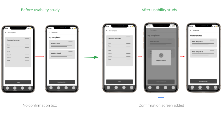
Early designs allowed for customization, but after the first set of usability studies, I added a confirmation screen just after the template creation process to let users clearly know that they have successfully created a new meal template.
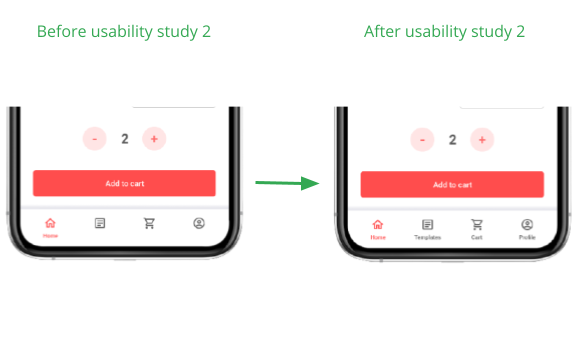
The second usability study revealed that users had trouble navigating through the bottom navigation bar in the first time. Therefore, I changed the design so that the navigation icons have their labels even when they aren’t selected.
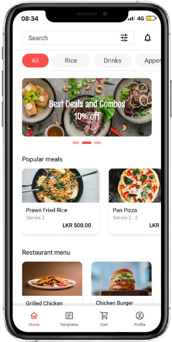
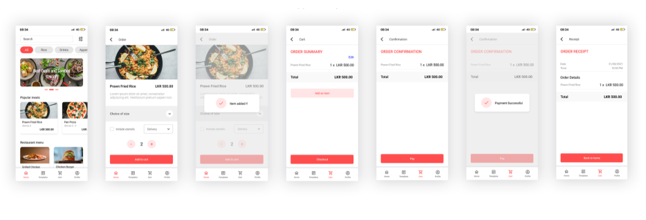
High fidelity prototype
The final high-fidelity prototype showcases cleaner and easy-to-use user flows for menu browsing, ordering a meal, checking out and the meal template creation process. View prototype.
Accessibility Considerations
Language change support feature is added to the design so that users language barriers navigating through the app can read content with ease.
Used clear and simple icons to make the navigation process easier for everyone. Labels were also included to guide users within the app.
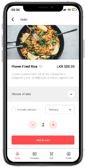
All meals have the area to provide detailed information so that users can choose any meal item after reading without hesitation.
Takeaways
Impact:
The Dinemore app focuses on keeping users at the utmost center in order to meet their needs and live up to their satisfaction.
One quote from peer feedback:
“The app is fun, engaging and most importantly it features methods to save loads of time which helps busy people like myself. I would definitely use this app and recommend it to people to try it out.”
What I learned:
The first ideas once I started designing were just the start of a much larger process. Interviews, empathy maps, usability studies and peer feedback influenced almost each and every part of the app’s designs.
Next Steps
1
Conduct another round of usability studies to verify whether the pain points which were found earlier had been addressed and as a result improved the overall experience.
2
Conduct additional research and interviews in order to identify other new/ existing problems with menu and payment apps.
3
Conduct research, identify and add new and necessary accessibility technologies to the mobile app design so that more users can use the mobile app with ease.
Hope you enjoyed it!