User research summary
The user research was done by gathering several individuals and conducting interviews. Once the research was done, empathy maps for all participants were created to understand the users of the product and also their needs.
Most of the individuals who wanted the product was either in the mindset in living a healthy life or they have certain family members or known persons who had certain food related special requirements.
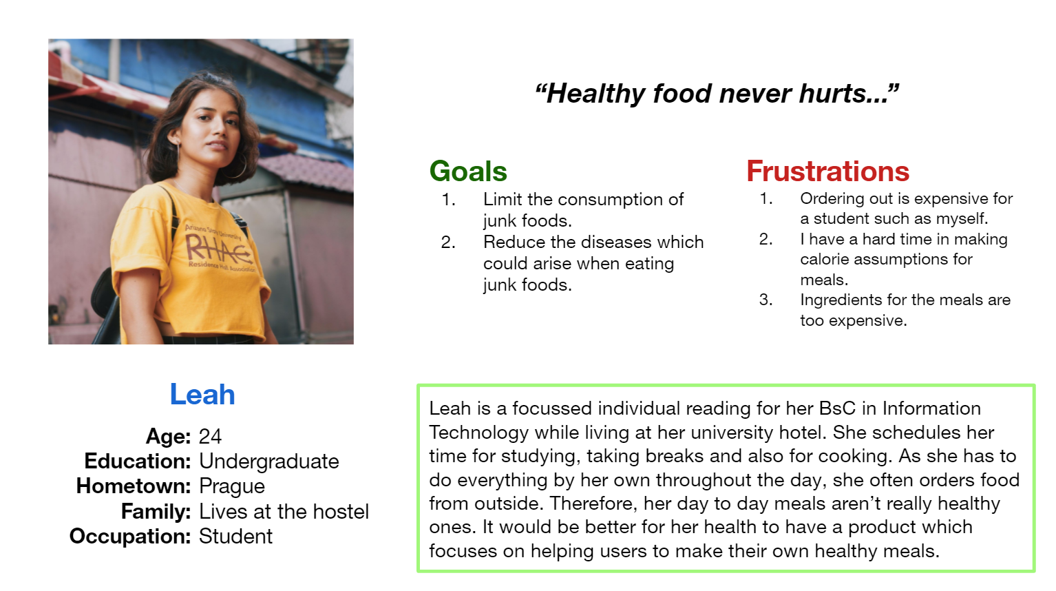
User persona: Leah
Problem Statement: Leah is an undergraduate student who needs an easy and simple health food recipe app because she wants to move away from all the junk food & focus on a healthy lifestyle.
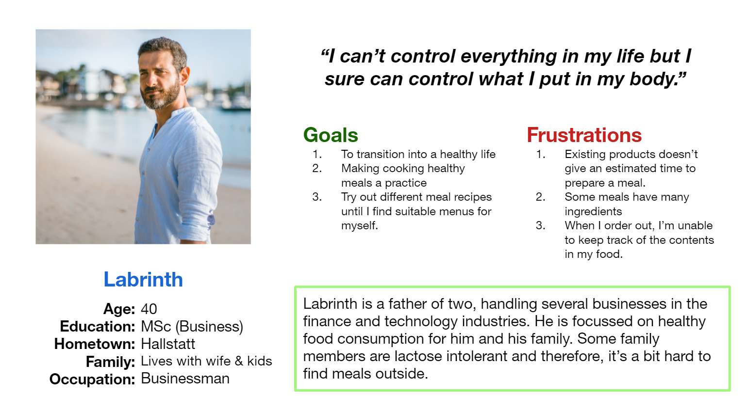
User persona: Labrinth
Problem Statement: Labrinth is a father & businessman who needs healthy food recipes & proper guidance to make healthy meals for his family because some of his family members are lactose intolerant.
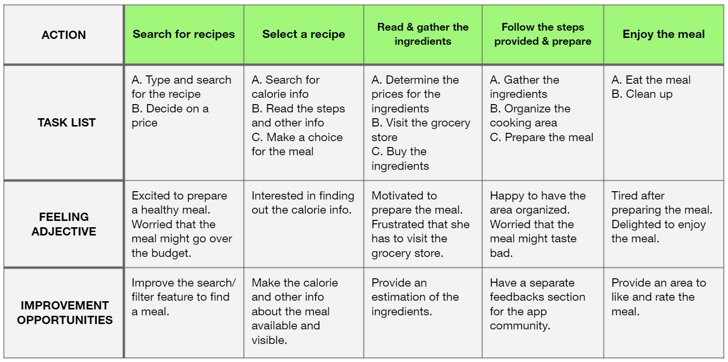
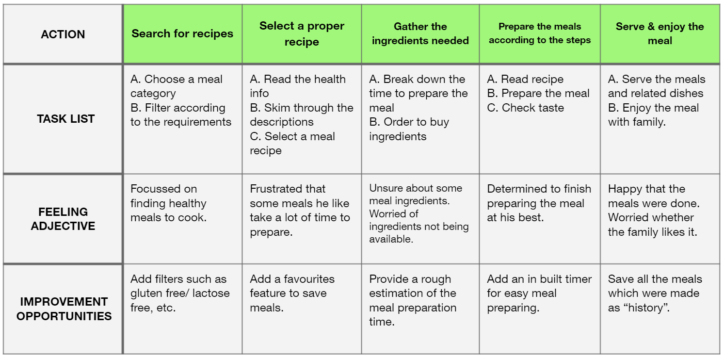
User Journey Maps
Ideation
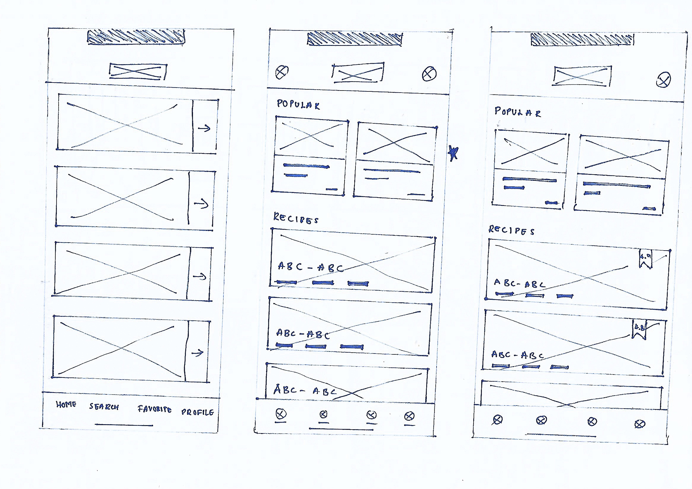
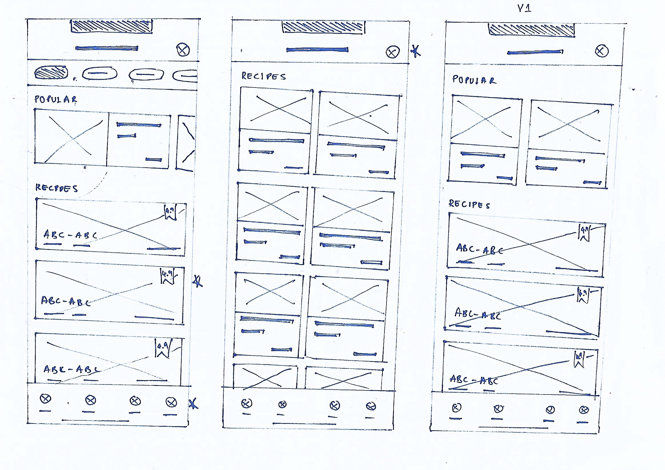
I performed several quick iterations for all the screens within the mobile app in order to address the gaps identified during the competitive audit. The following images show the iterations done for the home page of the Eat Up app. Five iterations & the final version is shown.
Digital Wireframes
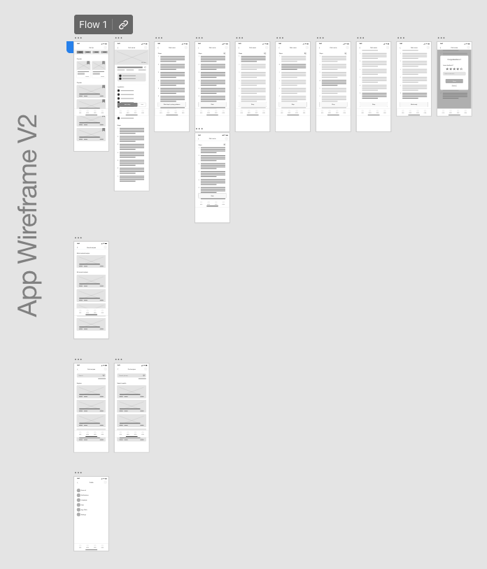
Once the paper wireframes were complete, I started working on the digital wireframes for the Eat Up app. The designs focus solely on giving the users the best experience.
Low fidelity prototype
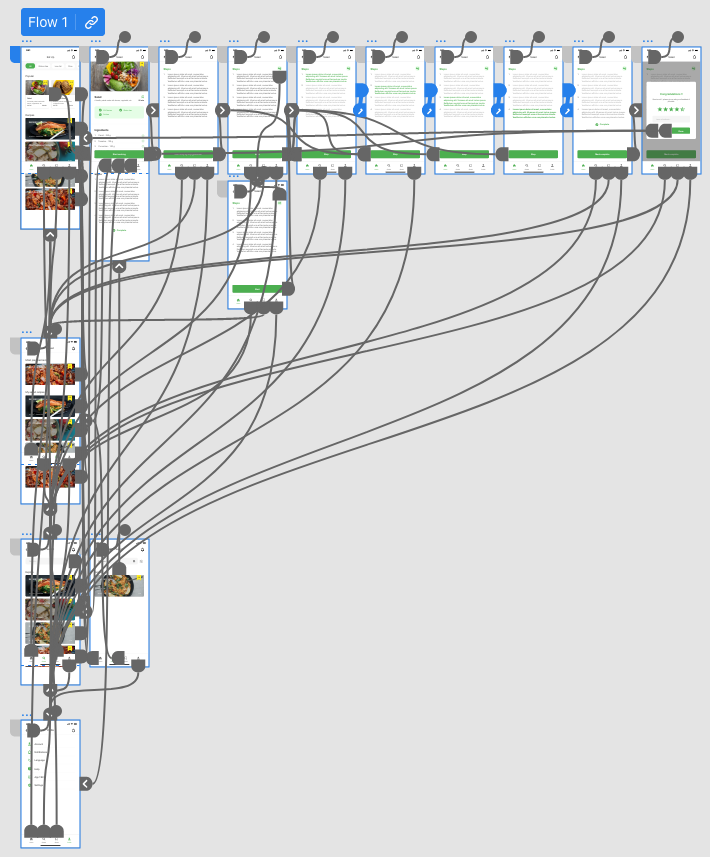
To showcase and use during the initial usability study I prepared a low-fidelity prototype with the basic navigation and activities enabled. I connected the flow so that users can experience how the app will showcase the recipe. View prototype.
Usability study findings
The usability studies gave certain insights for improvements within the designs.
1
The participants wanted a method to categorize the meal types so that it’s easier when searching.
2
Users wanted a method to view the ratings for a recipe before they opened it.
3
Participants of the usability study wanted a more common design layout for the feedback system.
Mockups
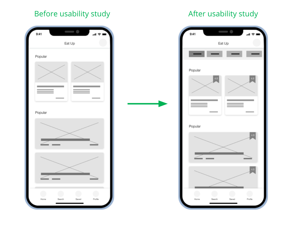
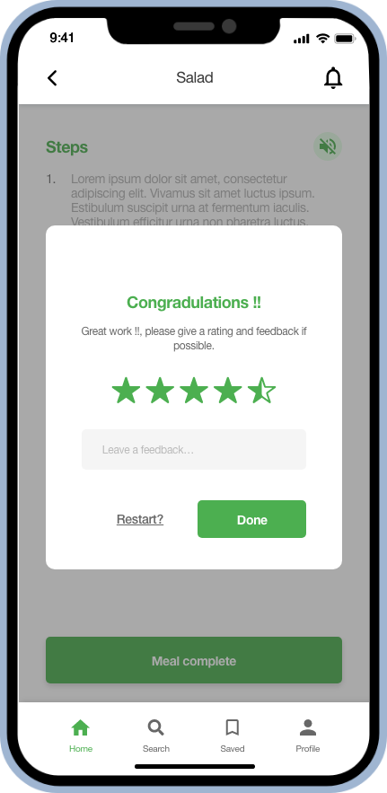
According to the insights obtained from the usability studies I conducted, several changed to the wireframes were made. A new top category filter feature was added for better filtering of results. Each food item now have their own ratings so users can view them before opening a recipe.
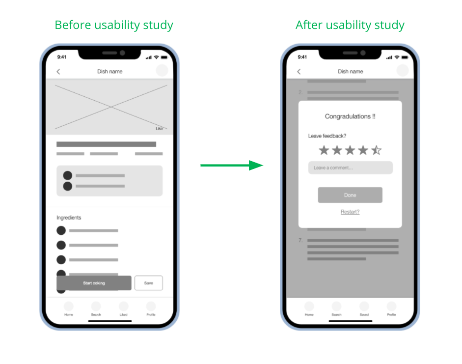
The feedback system which wasn’t very visible or as some participants described, it was not the usual feedback method that they are familiar with. Therefore, the feedback system was redesigned in a separate page towards the end of the recipe viewing flow.
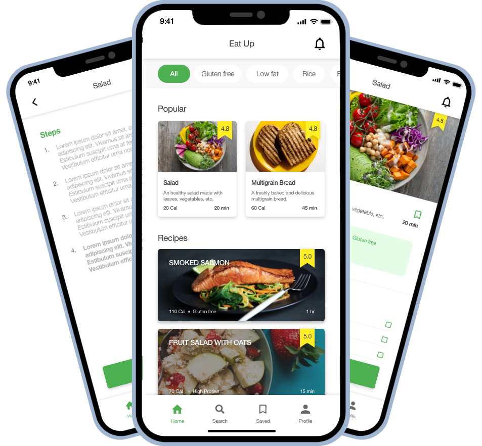
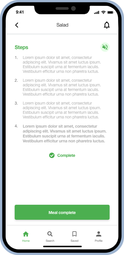
High fidelity prototype
The high-fidelity prototype followed the same flow as the low-fidelity prototype along with the modifications from the usability study. View prototype.
Accessibility Considerations
Screen reader supportable clear texts throughout the product.
Language change feature is added to the design to tackle language barriers while using the app.
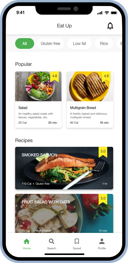
The home page shows some popular recipes initially. The saved recipes page shows the most prepared recipe at the top.
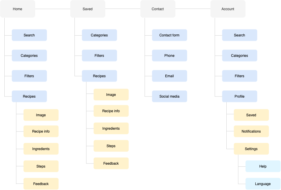
Sitemap
Once the designs of the mobile app ended, I started working on the responsive website. A sitemap for the Eat Up product line was created so that all information structures throughout all the products stay consistent while giving the best user experience.
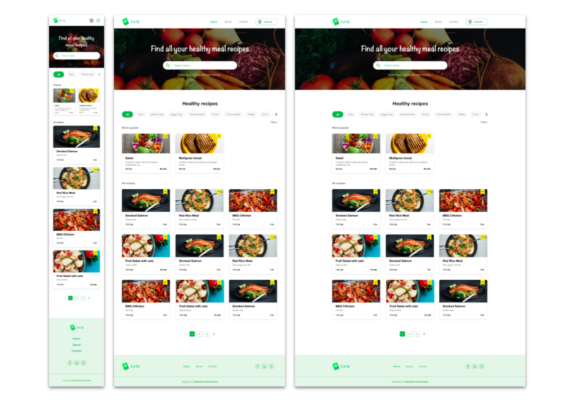
Responsive Designs
The responsive website for the Eat Up recipe online platform were designed focussed on all desktop, tablet and mobile phones. The following images shows the home page of the mobile , tablet and desktop versions. View Eat up website mockup.
Takeaways
Impact:
The Eat Up healthy meal recipe app and responsive helps users to prepare healthy meal recipes which are safe for different types of individuals who are in need of special meal types (eg:- gluten free) and also for ones who just want to move into a healthier lifestyle.
One quote from peer feedback:
“Eat up app is a really convenient and simple to use app which I believe provides the best experience to a user who wants to prepare a healthy meal, can get.”
What I learned:
This project helped me to increase my knowledge in creating designs for several platforms and in several size variations. Moreover, I learn a lot about the challenges people with different requirements in food consumption has to face everyday.
Next Steps
1
Conduct another round of usability study once the final design is done in order to verify that it meets the users’ needs.
2
Add additional accessibility technologies keeping people with differently abled in mind.
3
Include health tips and other medical information (safety guidelines) focussing people who have illnesses.
Eat healthy!