User research summary
I conducted interviews with several individuals and created empathy maps in order to understand the users for which I’m designing the product for and also their needs. There were several types of individuals but a certain group stood out the most, and they were entrepreneurs and business owners who mainly deals with imports and exports from and to multiple countries.
User research: Pain points
1
Experience
Most of the sites that have this feature aren’t user friendly.
2
Clustered info
The information which are displayed aren’t exactly 100% what the users need from the tracking feature.
3
Navigation
Some websites does not have a clear navigation for users to locate the tracking feature easily.
4
Interaction
Existing sites aren’t actually 100% responsive when it comes to mobile devices and therefore has a hard time in following the process.
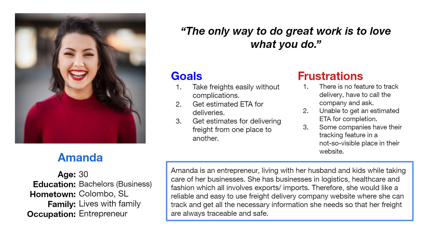
User persona: Amanda
Problem Statement: Amanda is an entrepreneur who needs a simple and easy to use freight delivery tracking feature because she wants her online freight delivery tracking process, a worry free one.
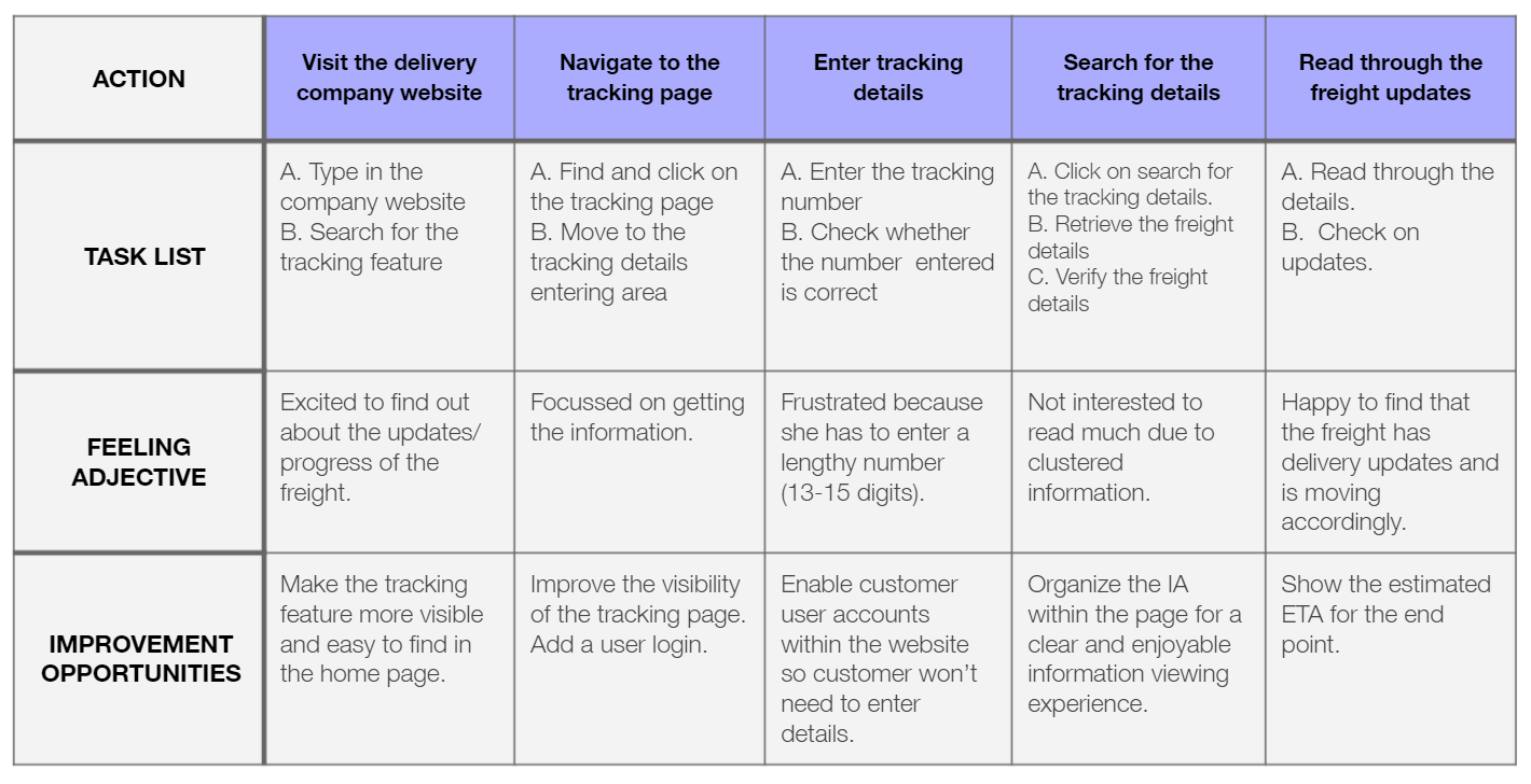
User Journey Map
I created a user journey map of Amanda to pinpoint the user pain points along with the improvement opportunities.
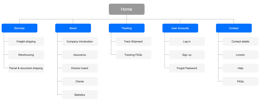
Sitemap
Due to the existing navigation problems the users have while using the sites, I created a sitemap to organize the information components which will be in each page.
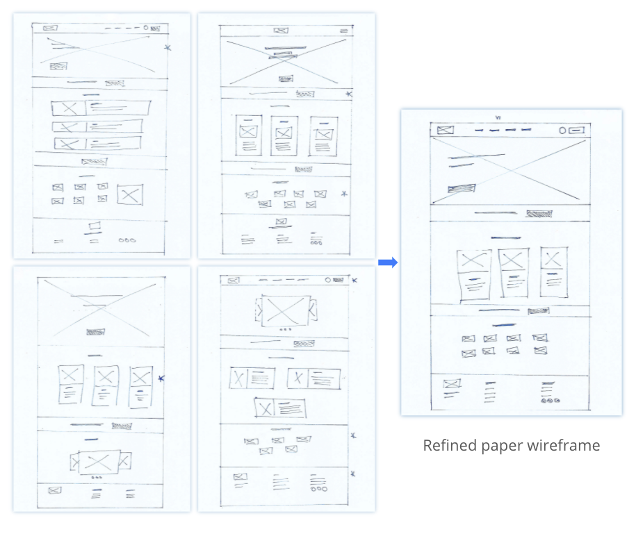
Paper Wireframes
Next, for each screen I created paper wireframes to properly layout components and put ideas into paper. The images to the right shows the different iterations done for the home page before finalizing.
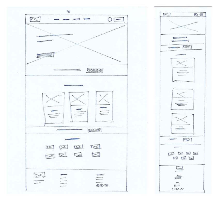
Paper Wireframes (screen size variations)
In order to make the ShipEx site mobile responsive because users will move from phones to desktops from time to time or prefer to use one device completely, I designed the mobile versions as well.
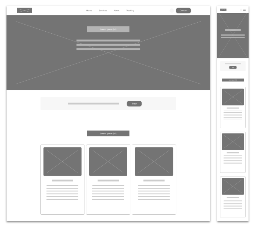
Digital Wireframes
Moving from the paper to digital wireframing phase helped find solutions addressing user pain points. Prioritizing useful button locations and text locations were a key part of my strategy.
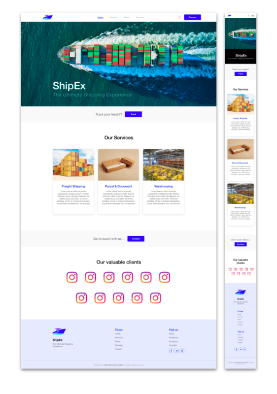
Digital Wireframes (screen size variations)
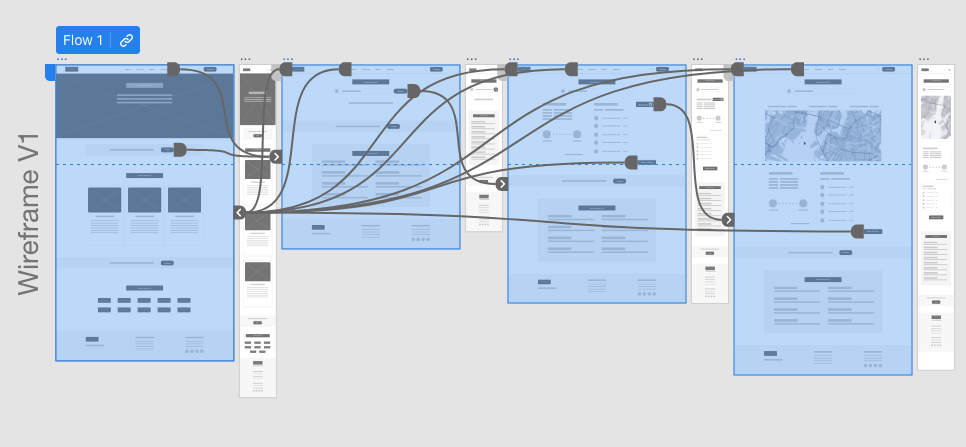
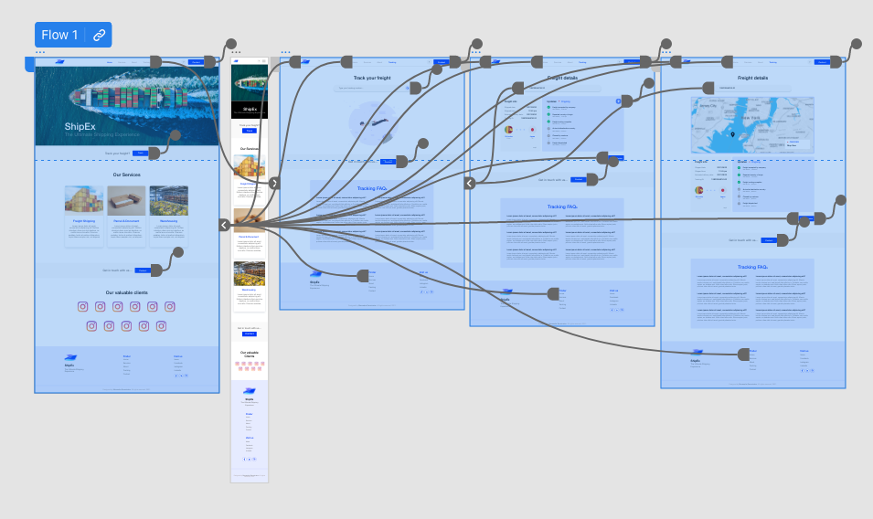
Low fidelity prototype
I designed the wireframes and connected for the main user flow, which is the freight tracking flow so that it will be easy to interact with during the first usability study session. View prototype.
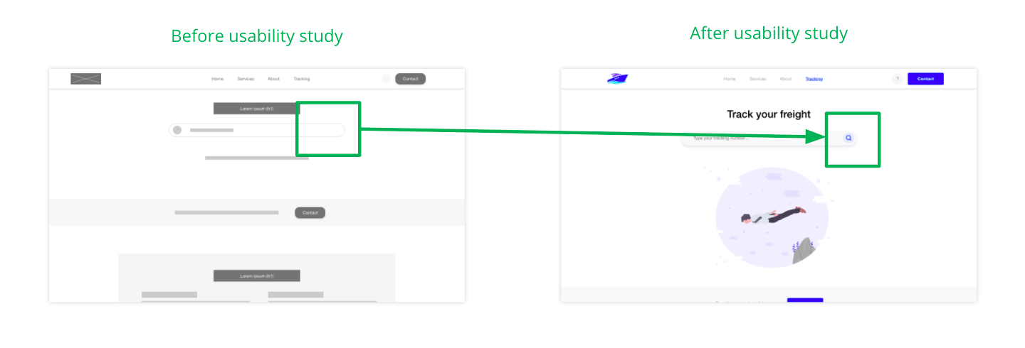
Usability study findings
The following are the output from the usability study session.
1
Search
In the desktop version some users searched for a search button after typing within the search bar.
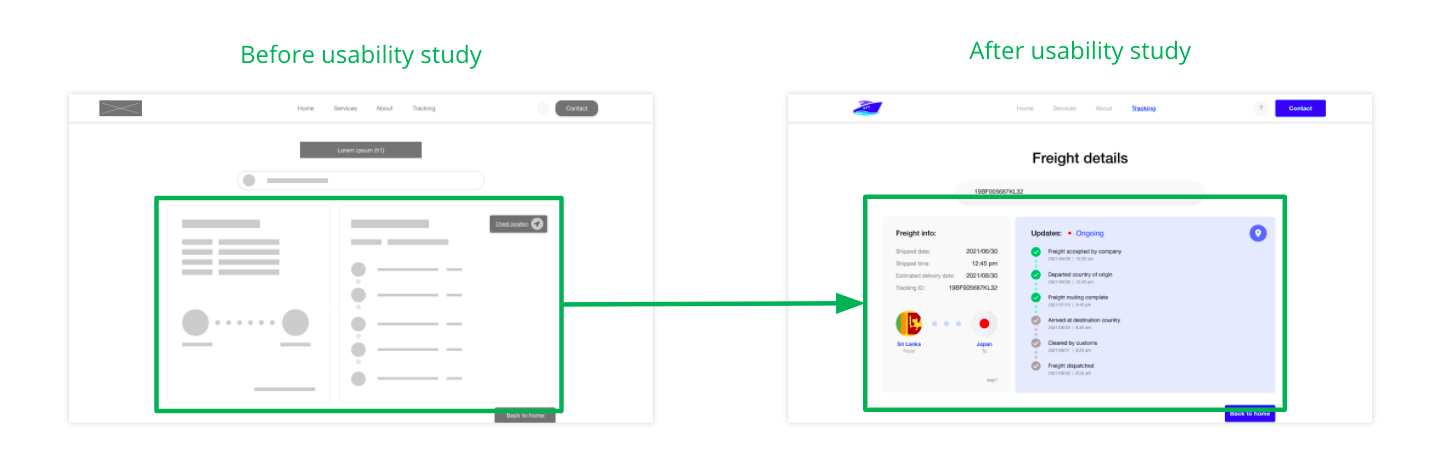
2
Search Results
Users were confused due to the structural organization of the search results.
3
Map
Users were a bit confused as to what they were looking at when they moved to the map page.
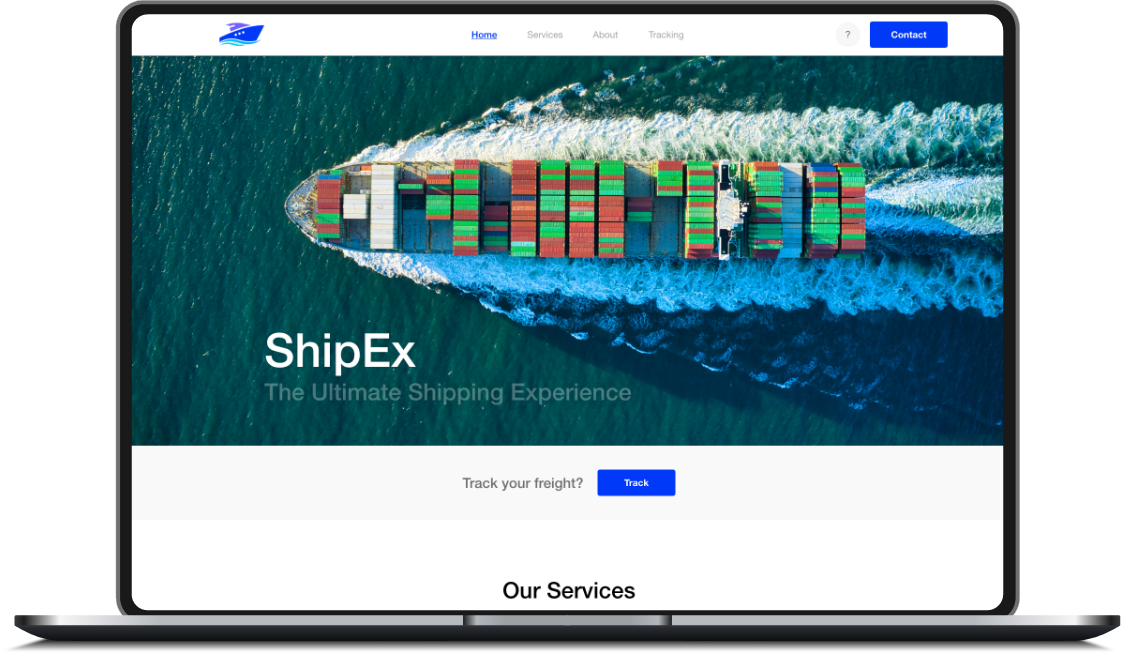
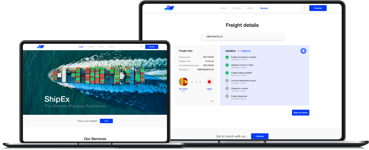
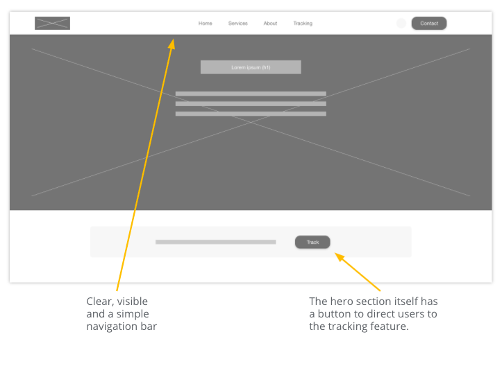
Mockups
After feedback from the usability studies, I added a search button for non-keyboard users for the tracking ID search bar.
I detailed and simplified the information displayed in the dashboard for the search results and made it so that it showed only what the user needs to and wants to see.
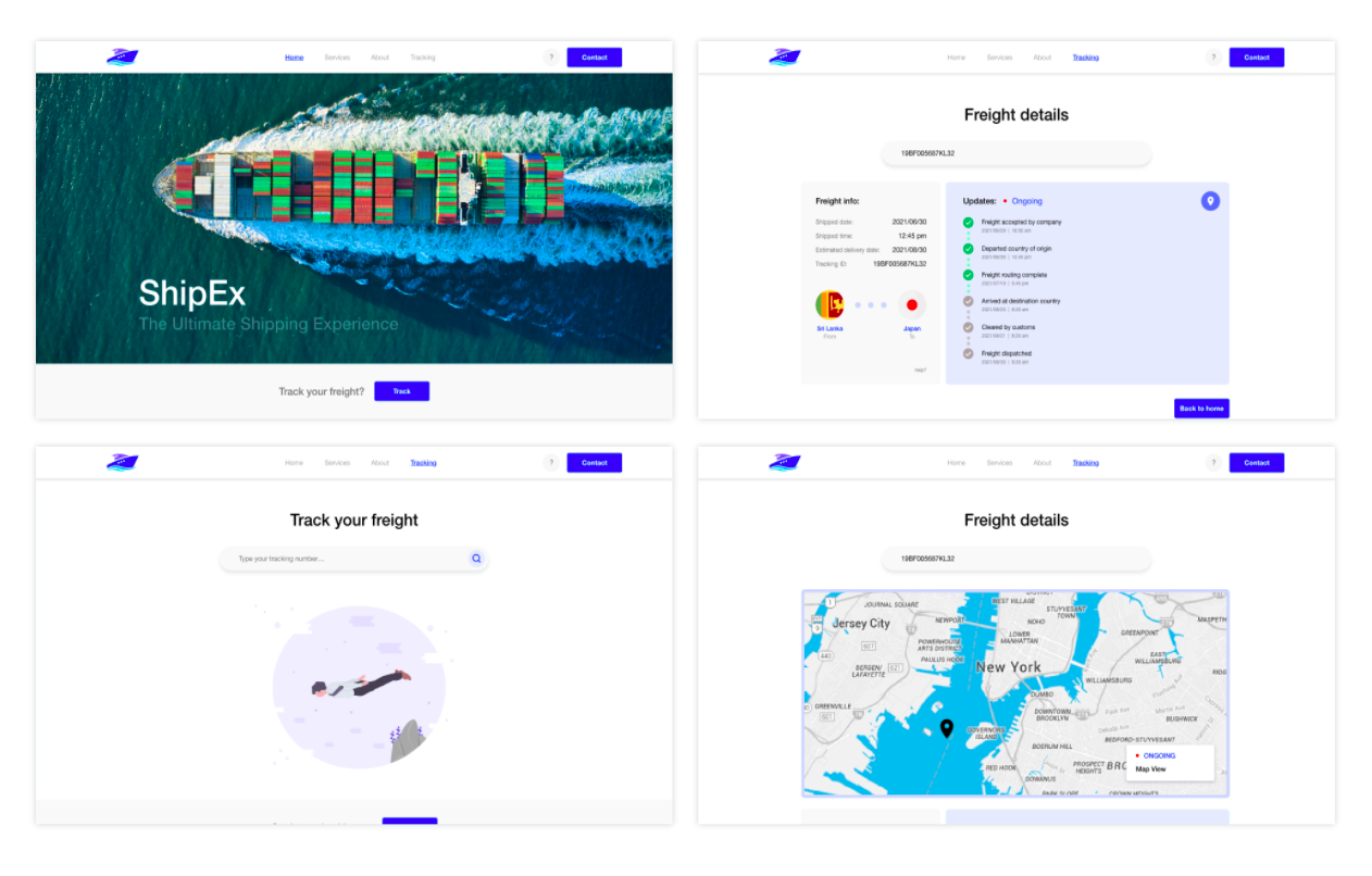
Mockups (Original screen size)
Mockups (Screen size variations)
High fidelity prototype
The high-fidelity mockup followed the same flow of the low-fidelity prototype. It also includes certain changes after the usability study. View prototype.
Accessibility Considerations
The headings are in different sizes with respect to its level of priority in order to maintain clear visual hierarchy.
Alt text is used in all texts and images therefore the users who rely on assistive technologies can have screen reader access.
Colors used for the web pages have been thoroughly checked whether they aligns with color guidelines.
Takeaways
Impact:
Feedback from users showed that the product is simple and easy to navigate and also the users always have a clear idea of where they are during a certain process along with engaging imagery and hierarchical text usage.
What I learned:
One main thing is that, even the very little things matter when designing anything. Small positive changes adds up to a bigger and better overall product.
Next Steps
1
To conduct another round of follow up usability study session.
2
Iterate on the tracking ID search component in order to simplify the details provided to the user.
3
Identify new features and areas that needs improvements (assistive technologies included).
Thanks & take care.